process
A deep dive into a few pieces. This section covers the evolution from preliminary to final work, and my favorite part of the whole design process: research!
Querida Abuelita
After moving to the United States, Carlos, a Colombian national, sends his first letter and postcard to his abuelita (grandmother).

Sketch

Sketch vs. Final: The main difference between the sketch and the final are the lack of lines on Carlos’ jacket. During the sketch process, I pictured Carlos with a puffy jacket, but while working on the final, I realized I could achieve the same result by thickening the jacket’s shape and feathering the collar.
Final
Colors: Carlos’ electric blue jacket and warm-colored envelope capture the energy and love he put into the letter, which is in sharp contrast to all the other letters his grandmother received (piled underneath).
<3: I was able to sneak a heart inside Carlos’ glove in the final illustration, something that didn’t occur to me during the sketch phase.

Typography
Warm and Blocky: For Carlos’ handwriting, I chose Architects Daughter, a typeface that combines a natural, handwritten feel and blocky forms.


Postcard
Classic Meets Modern: The second illustration is a Boulder, Colorado postcard. I was inspired by the three-dimensional letterforms found in vintage postcards, especially the sense of motion that these letters convey. It almost feels like a waving flag—perfect for Boulder, a city long known as a mecca for outdoor adventure.

Pass the Torch: Boulder’s high altitude and supportive athletic culture make it an attractive training ground for elite athletes—including the 70 Olympians that live in the county. Since 1948, the University of Colorado Boulder has produced over 90 Olympic athletes.
Liftoff
Liftoff is an illustration of the Delta IV: Heavy rockets launching into space, accompanied by three astronaut-related stickers. The set illustrates to children how far education can take them—literally out of this world—and promotes mindsets that will help them along the way.
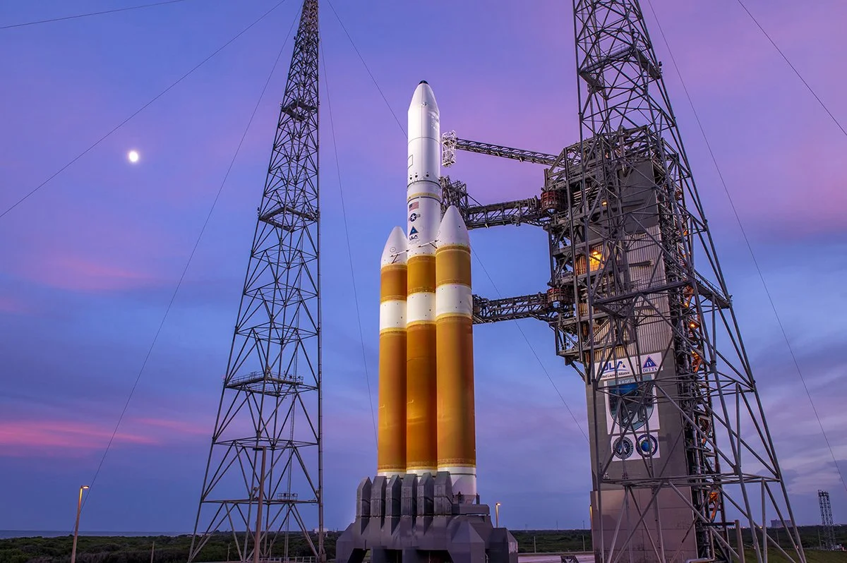
Look At Me: The Delta IV: Heavy rockets are powerful, modern, and have a long history of successful launches. The Delta IV’s size and color scheme make it difficult to ignore, making it a perfect choice for a poster.

Version 1

For my final, I chose a composition that was clear and easy to read from afar. The constellations represent education, and the rocket engines firing make the illustration more dynamic.
When I received feedback for this version, there was some confusion over the graduation cap constellation in the upper left. Some people understood it, others didn’t.
Final
An interesting suggestion I received was to try out a science-related constellation. I explored different beaker constellations and settled on the Erlenmeyer flask, a common sight in chemistry labs.
In the end, the new constellation was a big improvement over Version 1, and I’m glad people pointed it out.

Beaker and Flask Constellations
Fun fact: beakers have straight sides, and flasks are rounded vessels.


Stickers
Mindsets: Keeping in line with the illustration, these stickers promote the qualities found in great astronauts: an “I Can” mentality (Problem Solver) and a positive attitude (All Good).
In addition to its literal meaning, the Delta IV: Heavy sticker has a hidden meaning: flexibility. The fields of science and mathematics have a long and close relationship; in many ways, you can’t have one without the other. In mathematics, an uppercase delta (𝚫) means “change”, something all astronauts must embrace.

Better Tool, Better Sticker: After receiving feedback, a lot of the discussion revolved around the Problem Solver sticker. It felt too ordinary, not “spacey” enough.
I got back into researching and discovered astronauts use a specialized power tool in space. The Pistol Grip Tool is designed for astronauts’ thick-gloved hands, can keep a charge in extreme temperatures, and applies precise torques to bolts during repairs.
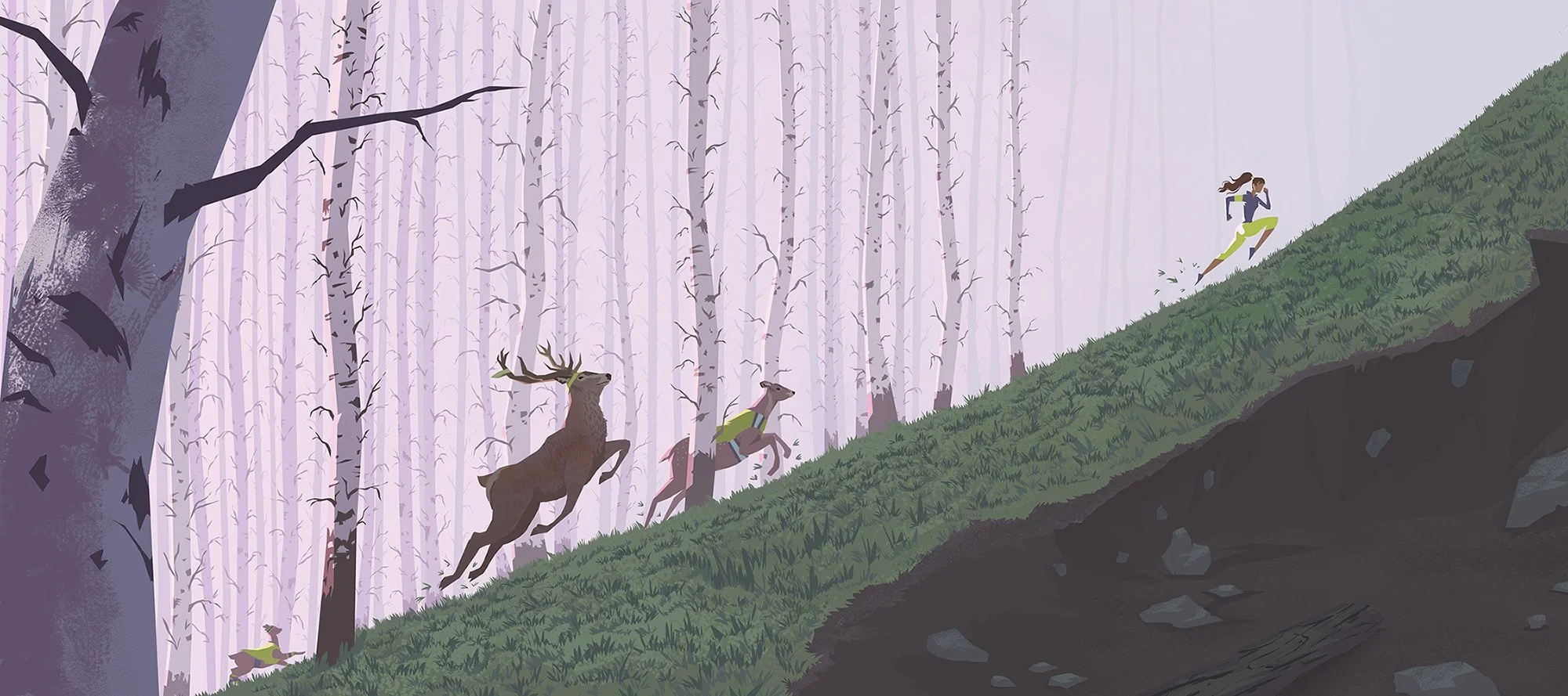
Family
Family illustrates the beauty and power of being part of a tight-knit group. I was inspired by deer I met while running in the Hayward hills.

Sketch
Exploration: My goal for this sketch was to capture a feeling through colors and shapes. I found myself using a lot of desaturated purples, which led to picking a complementary yellow-green as the family’s safety vest color.
Uncharted: I lit the family from behind and used a steep, diagonal composition to push the tension. The family is fighting gravity and heading into an uncertain future (represented by the hazy uphill area).
Final
Slight Tweaks: There isn’t a huge jump between the sketch and the final. Most of the work was polishing and finding the right deer reference to fix their proportions/anatomy.
After looking through forest pictures, I felt like my painting was too purple, so I added grass to liven it up.


Forest for the Trees: while gathering reference, I fell in love with Aspen trees, which are common in high-altitude locations. Aspen trees add more depth and interest to this piece than the thick trees in my sketch, but they also took a lot more time to build! In the end, the extra effort was worth it.
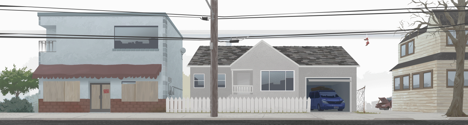
San Leandro Blvd.
San Leandro Blvd. captures the cascading effects of the pandemic on the Bay Area. In 2020, thousands of Bay Area businesses closed their doors permanently, migration out of the area increased, and many residents who remained struggled to make ends meet.


Sketch
Old Treasure: I sketched this in 2015 while thinking about my daily commute down San Leandro Blvd. Six years later, the tone of this sketch grabbed my attention and seemed relevant to what was happening in the world.
Final
Progressive Decay: From left to right, the buildings tell a story of a small business closing, a family that’s moving, and a family that is broke. The lively bush on the left represents a healthy economy; the leafless tree on the right, a withering economy. The BART train reinforces the left-to-right flow of events.


Life Beyond: Reflections throughout the illustration give a sense of a world beyond the dimensions of this piece.

Not Just Any Train: Although the BART train is in the distant background, it was important to depict it accurately in order to establish this scene in the Bay Area.